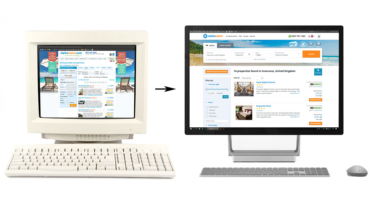
Shortly after starting at Alpharooms, it became apparent to me that their website would benefit from a number of user interface updates. Before work could begin, I wanted to highlight some problem areas of the old layout and present my ideas how we could improve them, but the more I looked, the more issues I found. In the end I was basically proposing a complete redesign of the entire website.
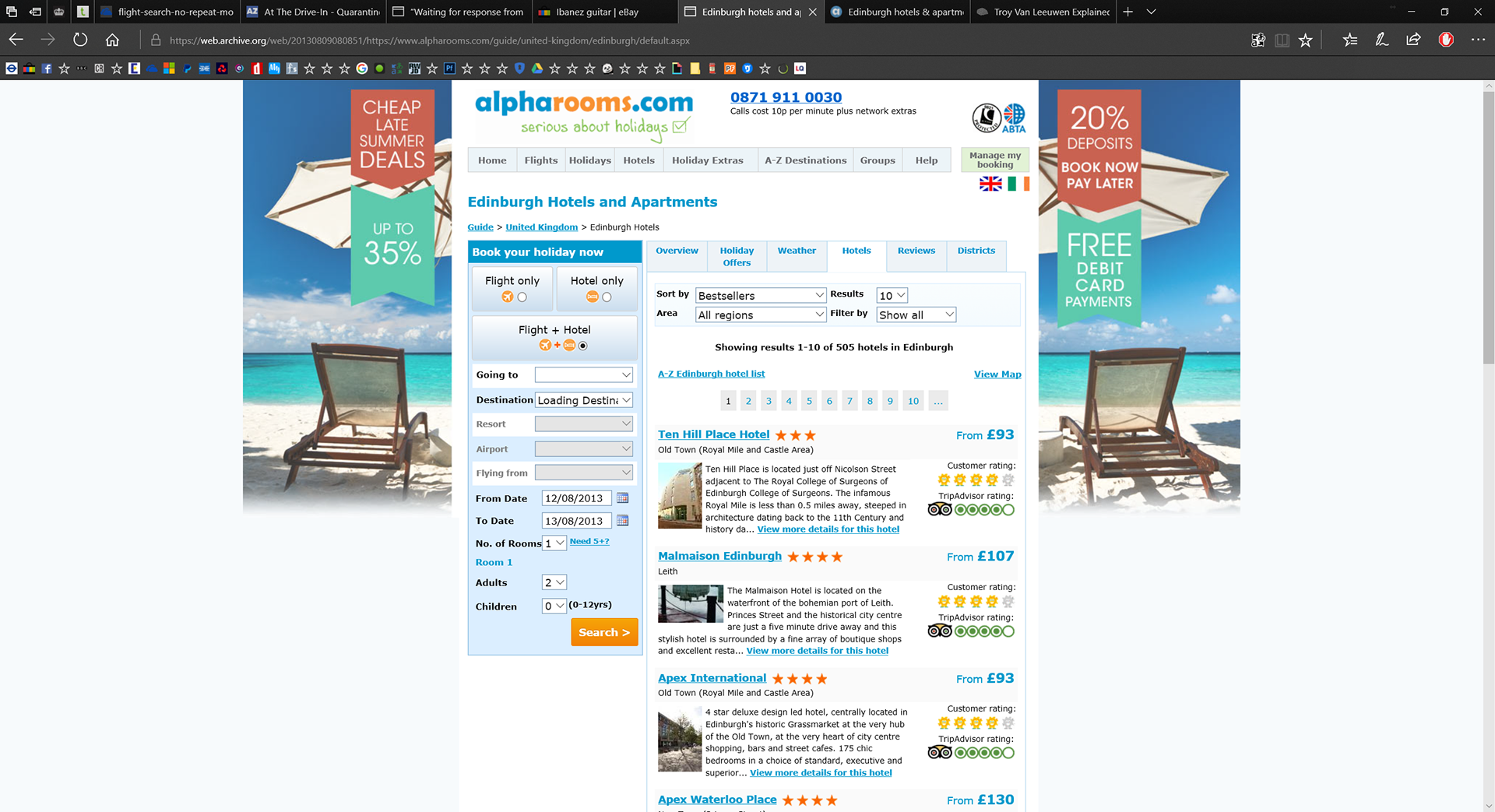
Old site layout
A big problem with the old layout was that it didn't work very well for customers using touch screen devices, due in part to the dozens of small drop menues and fiddly links. Besides that, the site looked quite cramped, so I wanted to open it up a bit.
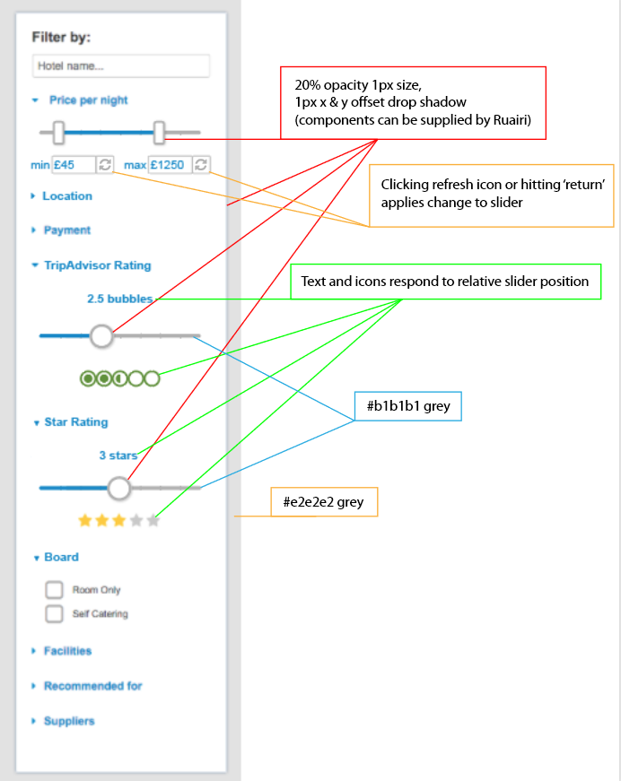
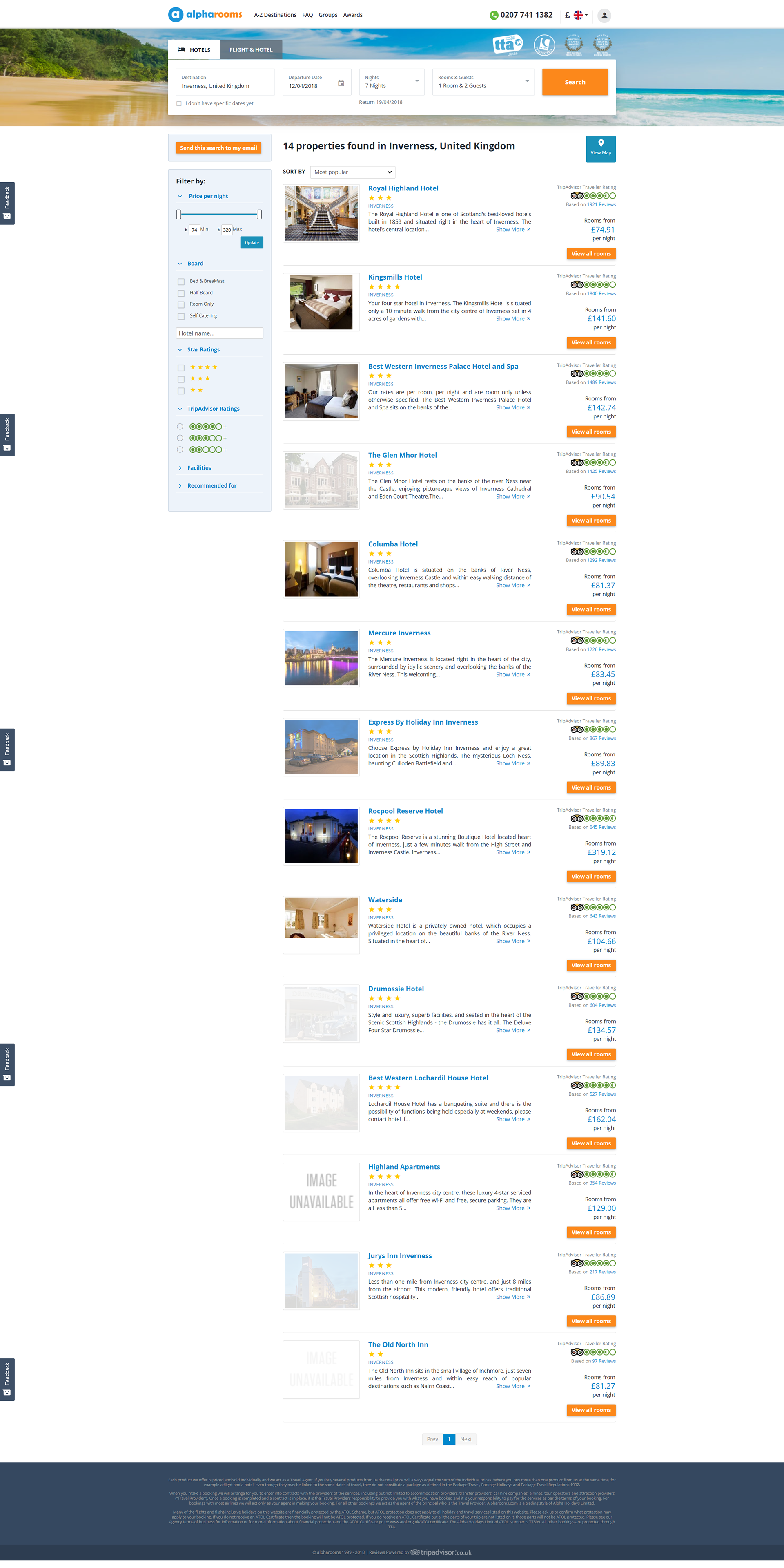
To make the site easier to navigate using touch, we adopted a minimum size requirement for anything that could be clicked or controlled by the user. Sliders and tick boxes were added where drop menues once were. Old-fashioned gradients were replaced with clean, flat colour and subtle drop shadows.
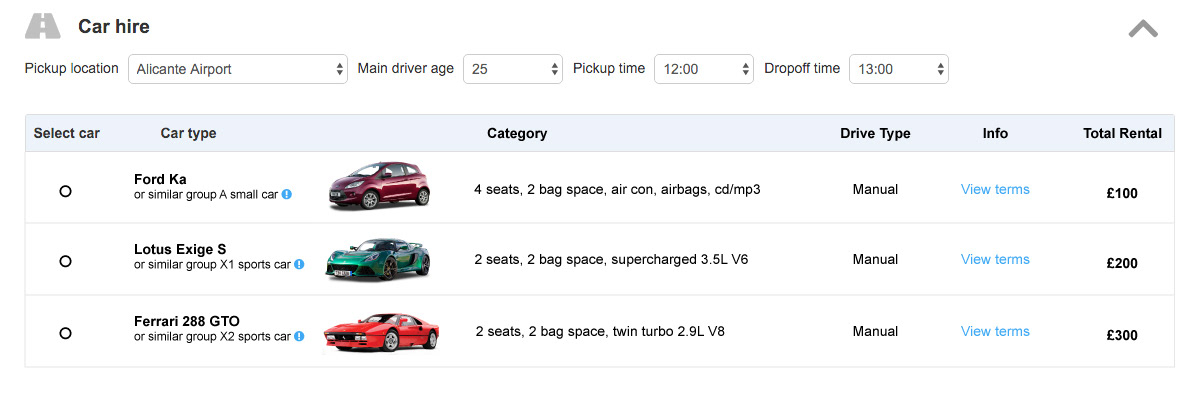
New features, such as airport car hire were required and included in the update. Any changes I made were after thorough research. Once implemented, a/b testing was carried out to measure the effect on conversions and engagement.
The results were very positive. Conversions and engagement all improved significantly.